Cloud Homepage Redesign: When Every Team Wants the Top Spot
Overview
A redesign of the cloud marketplace homepage, the first screen every buyer sees. The page was simple, but marketing, product and business all wanted the top spot. Instead of picking sides, I tested their version against one built from user research. The users' version won, lifting revenue 4% and helping bring AWS onto the platform.
Role
Product Designer
I helped lead the design team through problem discovery, user needs identification, UX strategy development, rapid iterations, and A/B testing to shape a solution that addressed both user and business goals.
Keywords
Growth Design
Vendor Integration
Stakeholder Alignment
Impact
↑4%
increase in revenue
≈$56M
added revenue in one quarter, on a $1.4B platform
✓ AWS Integrated
to expand service offerings and flexibility
What is the Cloud Platform?
A B2B SaaS marketplace generating $1.4B a quarter, where businesses buy and scale cloud solutions from Microsoft, Adobe, AWS and more in one place. Its homepage is the first screen every buyer sees.
Problem: High Traffic, Low Engagement
🔥 Most of the page was ignored
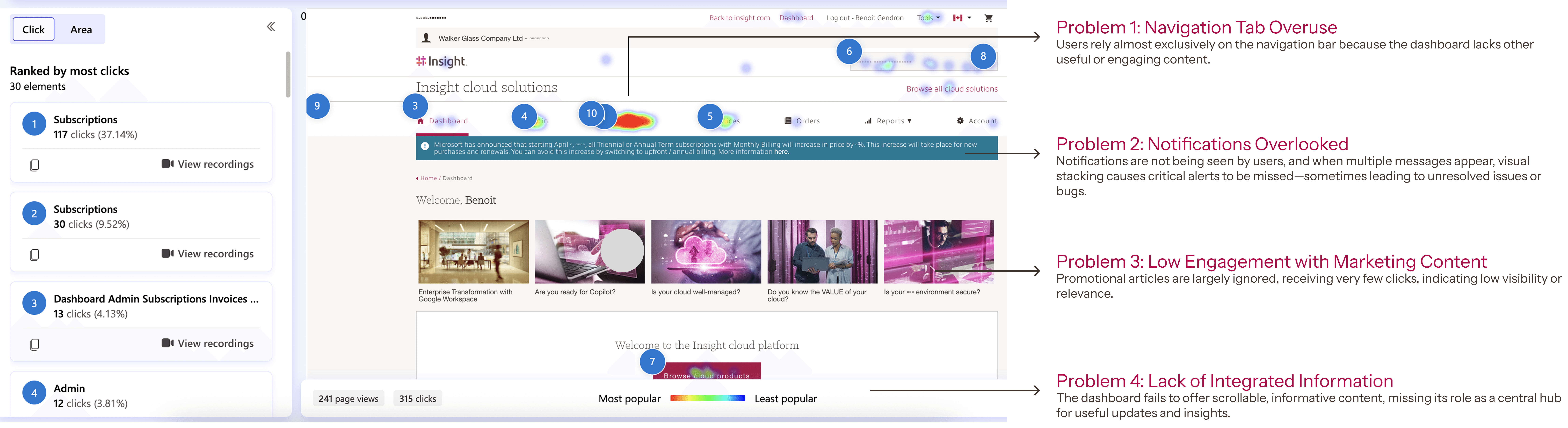
Microsoft Clarity heatmaps showed high traffic, but most of the page went unclicked.
🚨 Answers were hard to find
Account issues were buried and help was hard to locate, which led to complaints.📢 Updates had nowhere to live
Pricing and terms changes reached resellers too late.🏷️ Vendors were invisible
Buyers didn't know we carried AWS, so many bought it elsewhere
Challenge:
🧩 The dashboard needed to display a wide range of information, making prioritization difficult.
👥 Multiple cross-functional teams were involved, each with different goals and requirements.
⚖️ Aligning internal stakeholders while keeping the end-user experience at the center was critical.
🎯 We had to deeply consider
Solution
Design Process
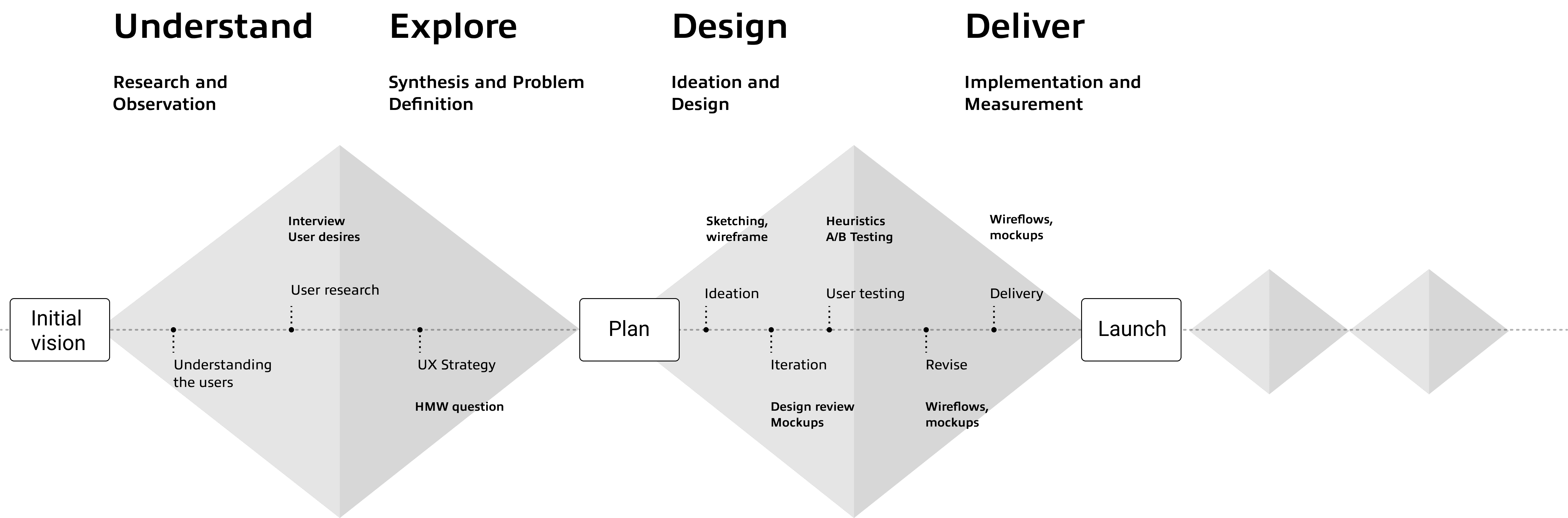
01 · Understand
Three user groups opened the same homepage for three different reasons.
Who are the stakeholders?
1: 🎧 ASM users (internal support)
Internal team members who access the platform to support customers, troubleshoot issues, and manage service-related tasks.
2: 🤝 Resellers
Partners who manage multiple client accounts, buying and provisioning software and services on their behalf.
3:👤 End users
Direct customers who use the platform to purchase, manage, and track their own software and hardware products.
User research
We conducted 25 1:1 interviews with each user group to understand their needs, capturing insights on sticky notes to visualize and prioritize key dashboard features.
User Desires
Needing a clear view of account issues
"When I log in, I just want to quickly know what's wrong and how to fix it."
– Sale Reps (Male, 40s)
Staying informed about system updates and releases
"If something changes, like pricing or termsI need to know first. It will affects my customers."
– Reseller at a regional IT services firm
Finding help and services more easily
"Sometimes I just need help, but I don’t know where to go on the site."
– IT manager at a mid-size company
02 · Explore
Before designing anything, we agreed on how to decide.
UX Strategy
Rank by user need, not by team
Every request was judged by one question: which user need does this serve? Each ask then got a defined place on the page, so no team had to win by pushing another down. When we couldn't agree, we didn't debate. We tested.
HMW Question
How might we transform the dashboard into a meaningful and engaging entry point that serves the diverse needs of all our users, while giving every team's priority a fair place on it?
03 · Design and iterate
Every team got a say. Users got the final word.
Version 1: Cross-Functional Alignment
We began with a low-fidelity prototype to quickly visualize concepts and align with the PO/PM and Marketing teams during early design reviews.
Based on initial user insights, this version focused on clarity and accessibility by introducing:
"Contact CCX Support" Button: For rapid end-user support.
Updates Hub: Notices, announcements, and release notes to keep resellers informed.
Pillar-Based Navigation: Categorized content to improve data organization across all user types.
Team Feedback:
Requested looping promotional content to highlight marketing campaigns.
Flagged that "Popular Cloud Categories" lacked visibility and required better placement.

Version 2: Business Alignment
Building on Version 1, we refined the early prototype to surface key business priorities:
Promotional Banners: Added looping content to highlight ongoing campaigns and services.
Optimized Placement: Improved the visibility of "Popular Cloud Categories" so users could easily find featured products.
Team Feedback:
Showcase Vendor Info: Highlight brand logos/names prominently to improve recognition of supported products.
Plan for Guest UX: Design a future guest-facing dashboard so prospective customers can explore without logging in.
Positive Reception: The team validated the overall layout, visual direction, and clean presentation.

A/B testing
Version A followed what internal stakeholders asked for. Version B was built from what users told us in research. Instead of debating whose priorities mattered more, I proposed testing both with real users in Adobe Analytics.
Version A · Stakeholder-led

Version B · User-led

Test Result
Version B clearly won on engagement (the chart is illustrative; real metrics are under NDA). Because users made the call, not design, stakeholders backed it quickly, and their key asks, like the promo banner and vendor logos, still made it into the final design.

04 · Final design
One homepage, with a clear place for every team.
Authenticated users
Reduces friction and boosts conversions

Prominent CTAs (“Contact us” & “Shop our cloud products”)
Instills trust and lowers bounce rates
Brand Carousel featuring Adobe, Google, Microsoft, Insight, and moreDrives click-throughs on key offers
Promotional Banner highlighting current deals and product benefitsSpeeds up discovery and engagement
Popular Cloud Categories Grid with top-used services at a glanceKeeps guests focused and on-site longer
Minimal Distractions—streamlined layout for first-time or casual visitors

Guest User
Encourages Exploration Without Commitment
Guests can immediately browse products and support options—no login required—lowering the barrier to entry and capturing casual visitors.
Builds Brand Trust Early
Prominent vendor logos and hero promotions reassure first-time visitors that they’re in the right place, increasing confidence and time on site.Highlights Conversion Opportunities
Clear “Contact us” and “Shop our cloud products” CTAs guide guests toward meaningful actions—driving leads and purchases even before account creation.Informs Personalized Onboarding
Tracking where guests click and what they view lays the groundwork for tailored sign-up flows and targeted content once they register.

05 · Outcome
Revenue grew 4%, and AWS came on board.
How the homepage brought in AWS
Before the redesign, many buyers didn't know we carried AWS. The brand carousel put every vendor we sell on the first screen. Buyers started buying AWS through us so they could manage all their cloud spend in one place, and that demand gave AWS a reason to invest in the partnership.
Team impact
By leveraging regular design reviews, rapid prototyping, and data from heatmaps and A/B tests, our cross-functional team of UX, marketing, and business moved quickly from insight to iteration, secured stronger stakeholder buy-in with clear visual artifacts, and built a shared sense of ownership around delivering measurable improvements.